

Every writer has their favourite font. Some edit with one and publish with another, while others remain dedicated to one font throughout their entire career. Like handwriting, people attribute certain personalities to fonts: Times New Roman (traditional), Helvetica (artsy) and Papyrus (new agey). Whereas despised fonts like Comic Sans and Curlz draw nothing but sneers. Choosing the right font to compel audiences may be trickier than you think, so let Wordsmith quell your doubts on the matter once and for all.
Fonts first came into being in the mid 1400s after Johannes Gutenberg invented the printing press. Today, Microsoft Word comes with 622 fonts - and the possibility of downloading 28,000 more. It doesn’t matter if they’re printed or digital, Colin Wheildon (author of Type & Layout: Are You Communicating or Just Making Pretty Shapes?) says: "It's possible to blow away three-quarters of our readers simply by choosing the wrong type. If you rely on words to sell, that should concern you deeply." Copywriters need to ensure they aren’t losing potential consumers from the get-go, and this starts with choosing the right font for your medium and audience.
To Serif or not to Serif?
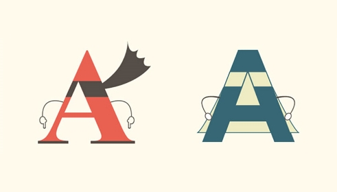
Serif fonts are letters that have small decorative flourishes at the ends of the strokes, displayed by the character on the left. On the right we have San Serifs, (Sans deriving from the French word for without) a typeface that eliminates these strokes. So the question is which font is better for the modern copywriter?
Happiness is Times New Roman
Times New Roman grew in popularity during WWII. The reason was simple: paper was at a premium and Times New Roman took up less space than Garamond, Bodoni and other serif fonts. Today nearly every printed book, newspaper and magazine uses some type of serif font because of their readability.
The author of Cashvertising, Drew Eric Whitman, tested an audience’s response to three different fonts - two serif fonts (Times New Roman and Garamond) and one sans serif (Helvetica). Results showed that 66% preferred Garamond; 31.5% Times New Roman, and only the remaining 12.5% preferred Helvetica (out of 1 million people surveyed). So the next time you want to write offline copy for brochures, books, annual reports, speeches and scripts, choose from your collection of serif fonts (Times New Roman, Palatino, Georgia, Courier, Bookman and Garamond.)

Advent of the Internet: A Change In Pace
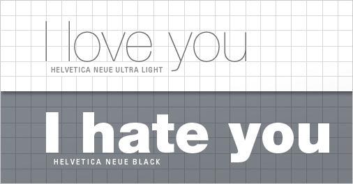
During the first decade of web content, serif fonts were the norm. However in recent years, there has been a noticeable shift towards sans serif fonts. In 2007, Microsoft changed their default font to Cambria instead of Times New Roman, while Google recently decided to rebrand itself with a Futura-ish logo. Sans serif fonts may be more eye-catching and appealing on screen, but trick is to not go overboard. Popular sans serif fonts like Helvetica, Arial, Calibri, Century Gothic and Verdana may be great for headlines and bite-sized snippets - but serif fonts are still more readable, especially when it comes to longer content.
Wordsmith’s Top Font
Our default font at Wordsmith, Baskerville, was designed by John Baskerville in 1757 and has been scientifically proven to increase the likelihood of readers agreeing with your writing. But that’s not the only reason why we use it. Its clean-cut curved strokes illustrate the perfect balance between serifs and san serifs, making it eye-catching yet legible.
For copywriters, typography is not something to be sniffed at, as the font you choose can directly affect your end result. Want to increase readability? Think serif fonts. Want an engaging title? Think sans fonts. And if you want to be taken seriously, think anything but comic sans!