When it comes to advertising and content marketing, copywriters are faced with a daily conundrum: short or long copy? No matter what the length, copy should resonate with your audiences. Don’t allow yourself to make decisions based around the mantra ‘the shorter the better’, because time and time again statistics prove otherwise. Did you stop to think perhaps your target audience might not want “big pictures” with ambiguous copy? There are times when short copy can result in miscommunication, misunderstanding and to put it quite simply, may miss the mark completely.
From a copywriter’s perspective we’re conditioned to love words. It’s built into our DNA - so of course we’re going to vouch for long copy! Take a gander at some of Wordsmith’s favourite long copy ads:
1. Krispy Creme
One of the toughest jobs a copywriter has, is to maintain consistency of interesting and engaging content throughout the length of their copy. Krispy Kreme excels in this area, by takes the brutally honest approach. Instead of “sugar coating” their already overly sugared doughnuts Krispy Kreme face up to their shortcomings. Charles H. Brower, Chairman of advertising agency BBDO commented, "Honesty is not only the best policy. It is rare enough nowadays to make you pleasantly conspicuous." They aren’t the healthiest things on the menu, but so what? It’s unapologetically committing the cardinal sin of advertisers in the confectionary industry - speaking the bittersweet truth. Krispy Kreme don’t advise you to overindulge in their delicious goodness, but instead celebrate life’s little pleasures. Life’s too short to be counting calories, so go on and have a doughnut.
2. Ugly Mug Coffe Campaign
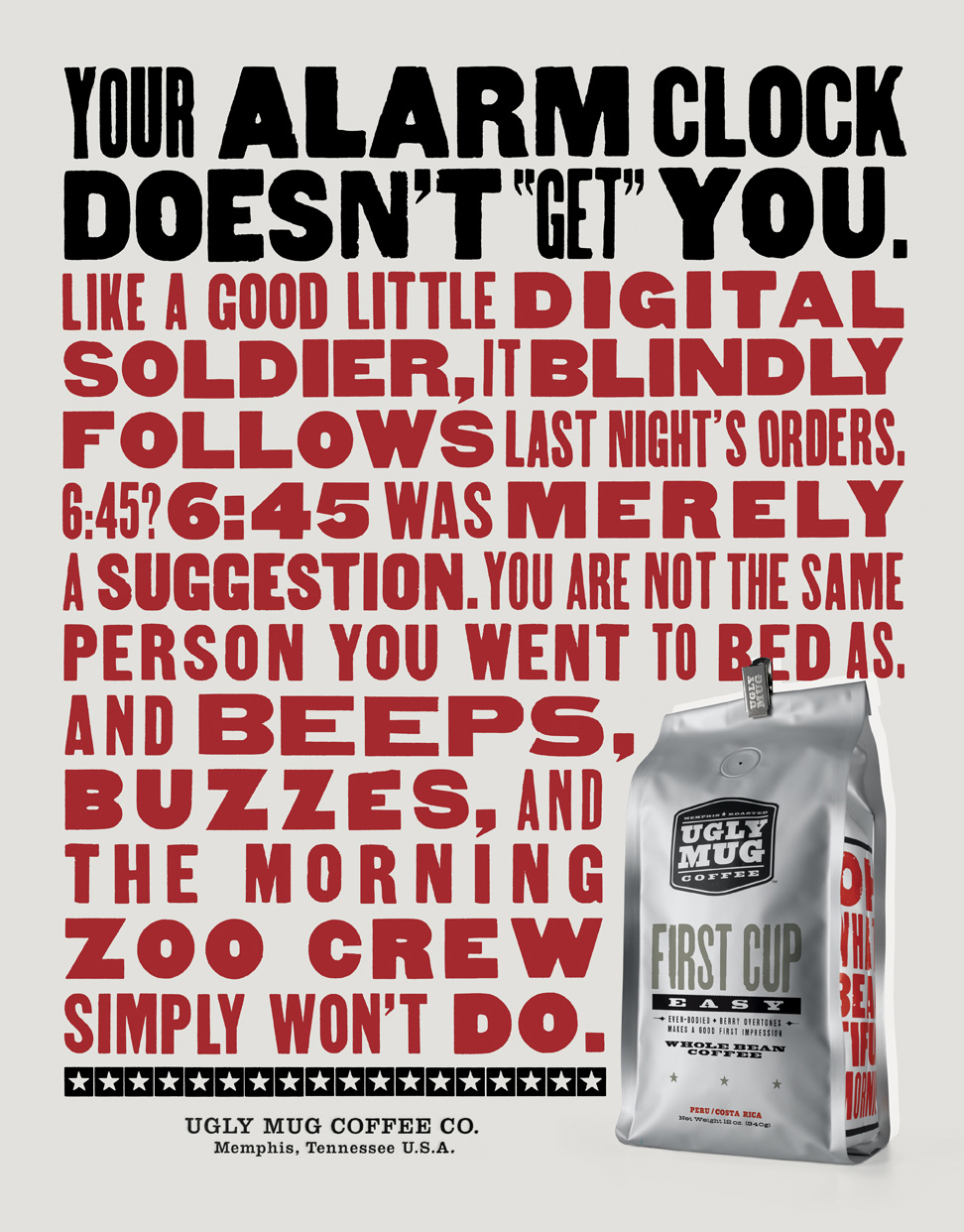
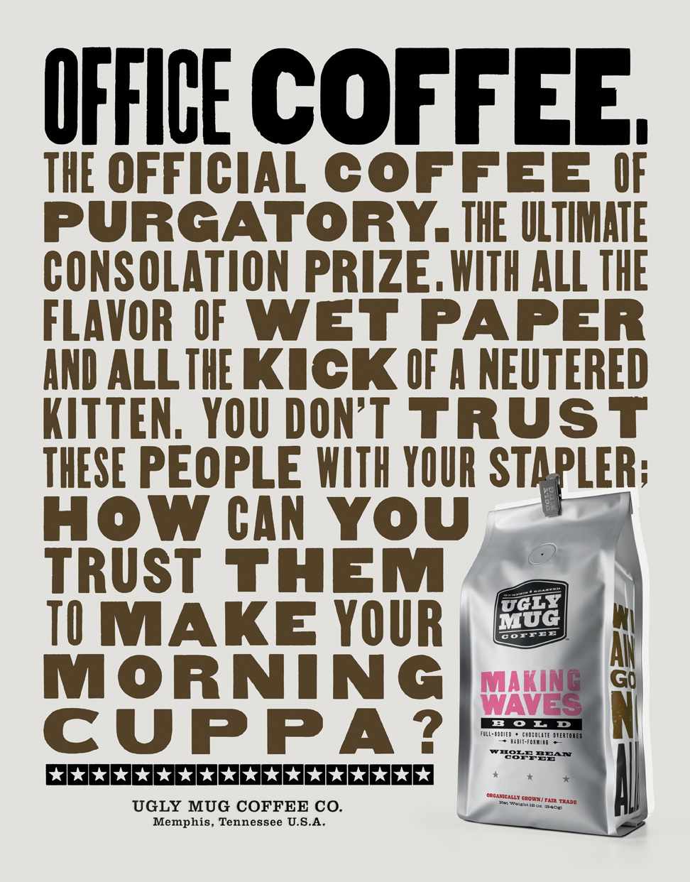
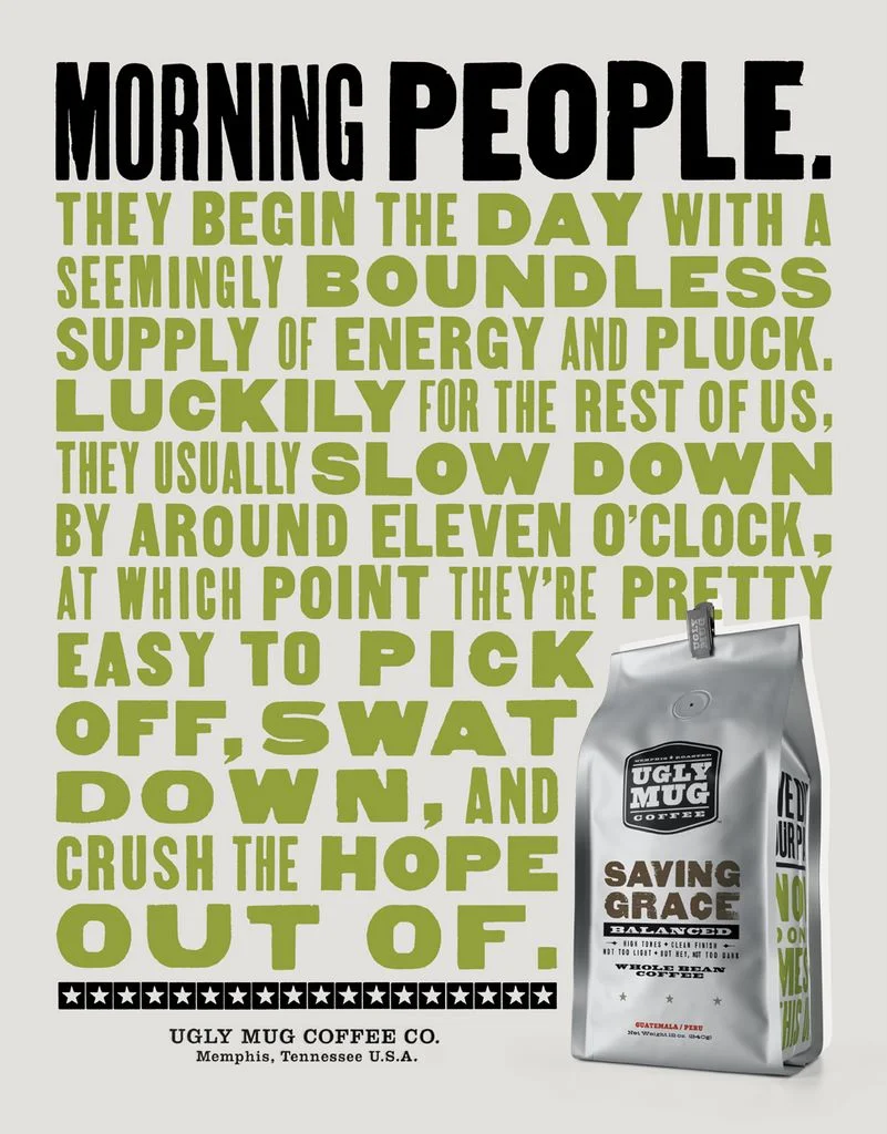
This 3-part, punchy advertising campaign by Young & Laramore proves that Ugly Mug Coffee really does exactly what it says on the pack – it wakes you up! Mixing “bold, authentic wood cut type and an anti-cloyingly- starbucksian-coziness-attitude” makes this copy eye-catchingly effective. It’s just what every office worker needs when choosing their morning cuppa - sarcasm, with a bit of humour on the side.
3. WHSmith
This copy is reverse psychology at its finest. “You really shouldn’t read this” makes it somehow dangerous, your interest is spiked and you’re intrigued enough to keep on reading. You are drawn towards the first and last phrases, with the clever usage of the “Serial Position Effect”, making recall a higher possibility. There is no doubt in the reader’s mind that this ad is witty, but the language is perfectly simple and conversational, leaving them with one lasting impression - go, buy a book and stop wasting your time reading boring adverts. You must admit they have a point.
4. Nokia
5. Specsavers
Specsavers’ creative hits the nail on the head when they produced this minimalist, yet fresh long copy ad – turning an embarrassing situation into a moment of solidarity for our four-eyed friends. The copy speaks to anyone who wears glasses, while not forgetting those who are close enough to squint. The copy subliminally sells the far-reaching benefits of Specsavers eyewear, while providing a great chuckle for consumers on their daily commute.
6. The Royal Park Foundation
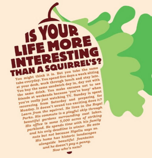
This animal-loving piece of long copy from MyAgency London urges consumers to “embrace your inner squirrel and help us protect and conserve the Royal Parks.” It also motivates readers to be more active, go outdoors and take in nature’s beauty once in a while. Royal Parks want to restore equilibrium and provide Londoners with some respite from the hustle and bustle of city living. You might not even notice that this nutty copy is longer than most, as it builds a compelling story that grabs the reader’s attention right from the get go.
7. H20 Walk For Water
This effective wrap-around copy was part of the “H2O Walk for Water” Campaign. It encourages sponsors to raise money for water projects by walking from any location beginning with H to a place beginning with O - 'H 2 O'. The subliminal call to action (CTA) through longer copy goes against the standard”short & sweet” approach utilised by most charity campaigners. The writing - coupled with compelling art direction, - draws readers’ attention to the striking contrast between London’s everyday cuppa and places where water is scarce.
8. JP Morgan
This striking copy from JP Morgan Financial Services was written and designed by a team of graduates at the AdSchool (formerly Axis AdSchool), Media Design School in Auckland, New Zealand. The darkened 0 attracts reader’s eyes towards the long copy within the middle of the ad. Distinguishing the difference a zero can make in a witty and humorous manner, this ad steps away from traditional financial advertising. Instead of facts and figures, you’re hit with just one number - even the copy itself refrains from using numbers.


