As the financial year draws to a close, the thoughts of listed companies turn to producing their annual reports. Although some treat this as a boilerplate reporting exercise seeking no more than regulatory compliance, the annual report is a fantastic opportunity to market your brand and your company’s investment potential. Looking to bring a spark of innovation to your annual report? Read on…
Tangling with the tone
Whether you see your annual report as a simple reporting tool or a marketing piece, it’s important to understand that audiences treat your report as an extension of your brand. While the main objective of any annual report is to inform investors about your company’s activities and financial performance during the year, it should ultimately link back to your brand’s core identity and tone of voice.
When readers pick up your annual report and see your branding, they should already have some pre-established notions about what style of writing to expect (eg. Nike seeks to empower users using words and stories that promote self-confidence, Apple advocates advanced technology that “just works”). Not delivering on this expectation would only confuse readers. Imagine if Disney, a long-established brand that’s all about spreading joy through entertainment, suddenly released a dull, bare-bones annual report… investors would probably think something terrible happened that year!
When writing an annual report, the vocabulary you use is just as important as your tone of voice. While it might be tempting to throw in financial or technical jargon to demonstrate your expertise, Wordsmith has always found that getting the point across concisely using words familiar to your readers delivers the best results.
Building a narrative
Have you ever read an annual report that came across like a hodgepodge of standalone sections? This is likely due to the lack of a key theme or narrative to bring the chapters together. In stark contrast to its otherwise colourful visual identity, Gap Inc.’s 2018 annual report is purely informational. As a result, the copy lacks coherence – in our opinion, a wasted opportunity to tell the story of the business’ development over the past year.
Instead, consider these annual reports from the Hong Kong Jockey Club and the Hong Kong Airport Authority. Each section flows smoothly into the next – the Jockey Club’s using the theme of cultural development to spotlight their latest achievements in the horseracing world, and the Airport Authority featuring themes of technological advancement, and collaboration within communities and across borders.
The Hong Kong Institute of Certified Public Accountants went with a fashion-oriented theme for their 2016 annual report. Much like fashion, accounting is an ever-evolving craft that requires years of dedication and commitment.
In each case, the theme is clearly stated at the beginning of the report. Copy on dividing spreads, section introductions and conclusions tie each topic back to the main theme, reinforcing the key message for the year.
Using the HKJC’s annual report as an example, we see the heading “Acting for the betterment of our society” on the first page, which immediately informs readers about theme for the year. This is reinforced through the copy: “we deliver to fans in Hong Kong and around the world one of the most international, exciting… racing experiences”, and further reinforced through sections regarding philanthropy and heritage conservation efforts – leading readers to associate the HKJC with selflessness, generosity and the community.
See how different styles of infographic design can be used to portray a variety of information – clever use of them cuts down on words and helps paint an easier picture for readers to understand.
The power of layout and all things visual
There’s no denying that humans are visual creatures. While it’s possible to read a report that is entirely in text, endless paragraphs of financial statistics are hardly appealing to look at – one of the reasons why Gap’s annual report feels so sparse compared to the reports from HKJC and HKIA.
To break up the monotony of text, consider strategic layout planning. We’ve all heard beauty brand FANCL’s slogan of “Less is more” countless times, but did you know that it’s applicable in marketing too? As convenient as it may be to cram oodles of text and figures onto a page, strategic use of negative space avoids overcrowding and provides a more comfortable reading experience. Your layout can also create a visual roadmap that guides readers from point to point.
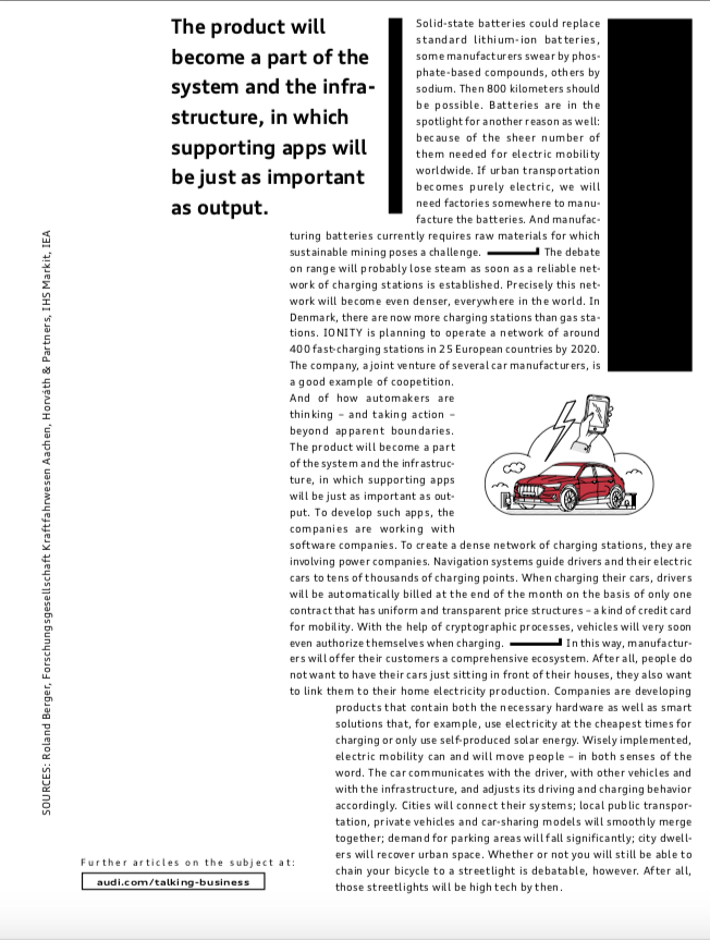
Luxury automobile brand Audi attempts to use white space in their 2018 annual report, but non-consistent hierarchy and odd layout designs create an unnatural flow that disrupts the reading experience.
Apart from clever spacing, consider using illustrations, photographs or infographics to create breathing room (with captions where applicable). Many online news sources structure their pages with integrated visuals to provide relief from large blocks of text. Infographics provide a vivid way to present statistics, while highlighting particularly important performance trends for readers.
Although annual reports are obligated to contain certain information, it doesn’t mean that your creative freedom is automatically restricted. From the copy to the visuals and layout, annual reports provide an ideal opportunity for copywriters and designers to work together and create a narrative that helps promote your brand. A boring annual report is forgettable at best, but a well-written, well-designed report can create a lasting impression on investors, business partners and the financial community.


