A sales pitch or advertisement is wasted if the call-to-action doesn’t inspire… well, an action. Not only would our clients resent us for sabotaging their content, but to fumble on the CTA is like dousing a cake with soy sauce after spending hours baking and decorating it – a lacklustre finish is a sure-fire way to taint audiences’ experiences and expectations. Join Wordsmith and let’s make those call-to-actions punchy and persuasive!
When call-to-actions hit
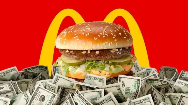
Whether or not you’re a fan of McDonald’s and their food, you’re probably aware that the multi-billion dollar fast food chain has been a hot topic in the United States. Earlier in the year, patrons were quick to voice their complaints on social media after they noticed increasingly pricy menu items – most notably the outrageous US$3 hash brown at one location and US$18 Big Mac meal at another.
Whatever the rationale for the high prices may be, we can’t comment too much upon it without being economists nor patrons at said locations. What we can comment on is President of McDonald’s USA Joe Erlinger’s open letter to the public following the outrage. In addition to explaining why prices at each location may differ, Erlinger ends his letter with a simple and impactful CTA:
“And because I can’t help myself, for the greatest way to unlock all the value we offer, be sure to download and use the McDonald’s app.”
Considering how competitive the dining industry has become, it’s no surprise that every restaurant chain has developed their own app and loyalty/rewards programmes. Pay attention to Erlinger’s tonality throughout his message as well – he could’ve been snarky and scoff at the doomsayers for not having all their details straight, but he kept a factual and apologetic tone while also empathising with the inconvenienced patrons. Not only that, he also proposes potential solutions via upcoming national programmes and the McDonald’s app. Using the open letter as an advertising tactic to introduce the app to new audiences is a pretty slick idea (some of the app exclusive deals are pretty neat too… like the free large fries offer with any US$1 purchase as of August 2024)!
Call-to-actions demystified
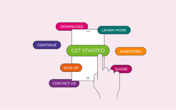
CTAs may only be about a sentence long, but they are composed of several elements that all require attention and detail to assemble:
1. The imperative
Every CTA represents something that you want your audiences to do. Be it to visit your website, buy your products, shake up their lifestyle behaviours, the most effective way to do so is by opening your CTA with a command.
“Check out our app for more information…”
“Visit your nearest store…”
“Click here to win…”
However, the most effective CTAs are ones that are low risk – in other words, they don’t ask much of your audiences. Clicking on a link is quick and easy, but to fill out a 20-minute questionnaire might be too much of a commitment (especially for first-time interactions)… save these for follow-up emails and readjust the incentives accordingly.
2. The incentive
What will the audience get by agreeing to your CTA? Think of each as a business transaction – neither you nor your audience should be doing anything for free, so both parties must receive a benefit from each transaction.
You get their business, they get a sweet new product etc.
Benefits don’t always need to have a monetary value either, even information can be valuable as long as there is a perceivable benefit to being well-informed!
3. Urgency (if applicable)
If something is only around for a short period, nothing motivates quite like the sense of urgency:
“Don’t miss out on…”
“For this week only…”
“Only six left!”
Although a sense of urgency is a handy motivator, you aren’t obligated to use it with every CTA. If you don’t have anything time sensitive to promote, artificially creating urgency may actually cost you conversions as audiences find your pushiness annoying or even desperate.
4. The copywriting and tone
Think about how you want to present your CTA. Do you want to be factual? Appeal to emotions?
In addition to the tone of your CTA, you need to ensure that the tone is consistent with the rest of your content. Imagine reading an informative blog article about SEO best practises – the content is factual and presents like a college essay, but then the CTA is suddenly bubbly and overwhelmingly friendly. This can confuse readers and drag their focus on the inconsistent tone rather than the CTA’s intent (they might even think you forgot to edit the piece, which is not so good for your reputation).
Now let’s put everything together. Here's how a CTA for an informational piece may look:
“Subscribe to our blog to stay up to date on the latest industry trends.”
“Don’t miss out on these fall marketing trends and secure those conversions.”
“Having troubles staying afloat of these trends? Call today for a free consultation!”
As marketers and copywriters, it is our duty to guide audiences to a decision. If our CTA makes them go “what happens now?”, then we’ve failed miserably. Remember, even the best CTAs will not always earn conversions, but the best CTAs will always have clear intents and incentives. When audiences don’t have to second-guess, they are more able to make an informed decision (and hopefully one that aligns with your plan)!


